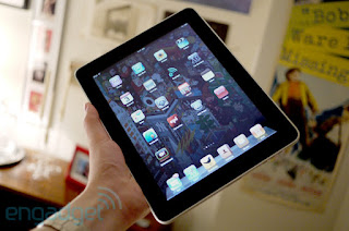
The Apple iPad. The name is a killing word -- more than a product -- it's a statement, an idea, and potentially a prime mover in the world of consumer electronics. Before iPad it was called the Apple Tablet, the Slate, Canvas, and a handful of other guesses -- but what was little more than rumor and speculation for nearly ten years is now very much a reality. Announced on January 27th to a middling response, Apple has been readying itself for what could be the most significant product launch in its history; the making (or breaking) of an entirely new class of computer for the company. The iPad is something in between its monumental iPhone and wildly successful MacBook line -- an usurper to the netbook throne, and possibly a sign of things to come for the entire personal computer market... if Apple delivers on its promises. And those are some big promises; the company has been tossing around words like "magical" and "revolutionary" to describe what many have dismissed as nothing more than a larger version of its iPod touch. But is that all there is to this device? Is the hope that Apple promises for this new computing experience nothing more than marketing fluff and strategic hyperbole? Or is this a different beast altogether -- a true sign that change has come to the world of the PC? We have the definitive answers to those questions (and many more) right here, so read on for our full review of the Apple iPad!
Hardware
Industrial design
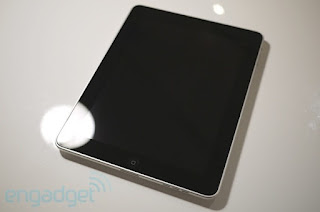
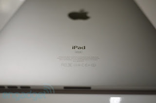
The first thing you notice about the iPad is, well, you don't really notice it. In many ways, there is just not much here -- design wise -- to comment on. The bulk of its surface is taken up by a 9.7-inch, 1024 x 768, capacitive, multitouch LED-backlit display surrounded by a glossy black bezel that some will say is too wide but, in practice, is an important design consideration that prevents the touchscreen from being inadvertently activated when handled. There's only Apple's signature "home" button to interact with, and the back of the device is a dutifully simple piece of curved aluminum. Like most Apple products, it's a beauty to behold, but it's not exactly notable for design flourishes; simply put, it's good looking but not terribly exciting. But if the design of the iPad is an exercise in restraint, it only serves to reinforce how formidable this technology feels once it's in your hands. The device has some heft, weighing in at 1.5 pounds, but is still comfortable to hang onto at most angles. Considering the computing power of the tablet, a thickness that tops out at half an inch is pretty impressive, too. But how does it feel in your hands? Well, that matte aluminum on the back surprisingly communicates warmth (though we don't recommend resting this on any bare flesh on a cold morning), and the rest of the design gets out of the way and lets you concentrate on what is really most important: that screen. And that's kind of the point, isn't it?
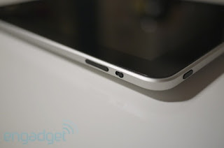
The iPad does house a few other components you should be aware of: a volume rocker and screen position lock (which forces the device to remain in landscape or portrait mode) on the upper right hand side, a power / sleep button and headphone jack on either side of its top edge, and Apple's famous 30-pin dock connector alongside a single thin speaker on the bottom of the unit. There is nothing outwardly notable about the buttons or layout on the iPad -- if you've used an iPod touch or iPhone, you'll find yourself right at home... and that's exactly how Apple wants it.
As far as ergonomics are concerned, the standard seated-with-iPad-in-lap move is a completely comfortable experience, but there are definitely use cases where handling a flat slab becomes a pain. For instance, single finger typing becomes a bit of a game of hunt-and-peck, and that's the situation you find yourself in if you're ever standing with the iPad or holding the device with your other hand. We mentioned that iPad has some weight to it, and while it's comfortable to hold, it is considerably more of a handful than an iPhone. You'll feel that weight in your arms after extended period of keeping it aloft. Apple promo videos like to show their users happily grabbing the iPad and swinging their legs up onto a table -- Fonz style -- but if you're like us, most of your heavy text entry is done while seated at a standard table or desk, which means that unless you have a dock you're going to be typing on the iPad as a flat surface. The thing is, we actually found the flat-typing experience to be pretty good; it takes a little getting used to, but it's not totally bizarre either. In fact, we'd say it's a much more enjoyable experience than single-hand typing. Still, just as with the iPhone, there is a learning curve here that may diminish some hit-and-run shoppers' interest.
Internals
As you probably know by now, the iPad packs Apple's custom, PA Semi-designed 1GHz A4 system-on-a-chip -- a single Cortex A8 core coupled with a PowerVR SGX GPU. RAM on the iPad hasn't been revealed, but we suspect there's 512MB (at least) inside here -- we'll know more once iFixit or someone else puts the pad under the knife. Also onboard is 802.11a/b/g/n WiFi, Bluetooth 2.1, a digital compass, an accelerometer, microphone, and ambient light sensor. The 3G model that ships at the end of the month will add UMTS / HSDPA data along with an AGPS chip. You can purchase the device in capacities of 16GB, 32GB, or 64GB. We had the 64GB version for this review.
In our testing, the A4 SOC seemed to deal with whatever we threw at it handily. From opening and rendering webpages to playing the most graphically intensive games (including scaled iPhone versions, of course), it didn't miss a beat. The photo app was particularly impressive, allowing for fast scrolling through high resolution pictures without a hiccup, and handling rotation and zooming with no resistance or hesitation. Applications themselves opened quickly -- not instantly. Of course, as many detractors have noted (Engadget included), there's no true multitasking here, so seeing a system with this much power perform admirably one app at a time wasn't a huge surprise, especially since we'd experienced the same thing on an earlier version at the January event (more on this in a moment). Still, it seems like the A4 has power to spare, and that's a good thing if the third party apps we used on the iPad were any indication of where things are headed -- more graphically intensive and packing far more functionality.
The battery -- a 25-watt-hour lithium-polymer (non-removable of course) -- held up surprisingly well in our testing. More on that in the battery section down below.
Display
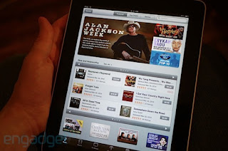
As we mentioned at the start of the review, the iPad is all about its screen, and Apple's 9.7-inch LED backlit IPS display does not disappoint. Colors on the screen are vibrant and saturated, while blacks feel true and deep. The iPad can be cranked up to an almost painful brightness, but also handles lower settings well -- that's especially important for readers (they even include a brightness control inside of iBooks). Because Apple employs IPS (in-plane switching) for the display, viewing angles are remarkably broad, though we can't honestly say the feature will come in handy for us -- we usually want to keep people's eyes off of our work. The screen is, as we mentioned, capacitive and multitouch, and handled input excellently -- if you're used to the iPhone, then you know how very good Apple's input technology is. To call it best in class would not be an overstatement; we've never used a more responsive screen.
We know there's a lot of talk about reading with this type of display versus a Kindle or other E-Ink device, but we'll just be straight with you -- it didn't hurt our eyes to use this as a reading device. You're able to crank the brightness down a significant amount, but it's also just a matter of adjustment. After a few minutes we didn't see the device or the screen tech anymore -- we saw a book. We won't speculate on what prolonged use will feel like, but there is data out there that suggests the technology might not be as important as some people think it is when it comes to e-reader displays.
Other hardware
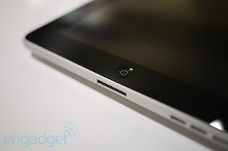
For the most part, there's not much else to say about the iPad when it comes to its physical attributes. The home button is your only point of hardware interaction with the software, though you have those volume controls and rotation lock switch. The speaker actually does a rather impressive job of outputting clean, well balanced sound given its size, but let's be honest -- you're not going to be using this as your party sound system. The 30-pin connector is standard issue for Apple's mobile products, but we have to take serious issue with the lack of a USB port or SD card reader. The company offers both of these as an accessory as a means to transfer photos and video onto the device, but it seems like such a glaring oversight to not have built these in that it bears mentioning. If Apple wants to compete with the netbook market -- which it presumably does -- there should be some port options beyond its proprietary dock connector. This just feels like a money grab and a waste of potential for third-party peripherals.
One piece of hardware you won't find here is a webcam, which we already mourned the lack of when we first saw the device. It's a bit of a crime that the iPad won't allow you to carry on an iChat or Skype video conversation, because holding this in your hands while talking to a friend or family member not only seems like a match made in heaven, but the total realization of one of our sci-fi fantasies. We know Apple couldn't possibly cram every component Engadget editors might have hoped for, but this one seemed like a no-brainer, and its omission has left pretty much everyone scratching their heads.
And one other item of note -- Apple chose to place the headphone jack at the top of the device. We don't know about you, but we think the idea of draping our headphone cord across the screen or snaking it around back is a tremendously bad idea. And guess what? In practice, it kind of stinks. Why the company didn't opt for putting the plug in the logical place -- say, the bottom of the iPad, or the side even -- is a mystery that will undoubtedly haunt our every waking moment.
Software
Operating system / User interface
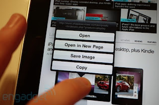
By now you should know that the iPad's interface is nearly identical in every way to the iPhone or iPod touch UI. The reason for that is obvious: it's built on the same operating system, a derivation of OS X for mobile devices. As far as actual navigation on the device goes, it really is exactly like the iPhone. You have pages and pages made up of grids of icons, a dock for your favorite apps (up to six, mind you), and a persistent status bar which displays the time and other information. In our opinion Apple has missed a huge opportunity to open up the "desktop" space on the iPad and allow for micro-apps or widgets on these screens. On the iPad there isn't really a single glanceable piece of information you can get at beyond the time and WiFi status -- and using all of that gorgeous screen real estate just to display a widely spaced grid of icons is not only a waste, but just kind of looks silly. In truth, if Apple's developers believe that it's not helpful to give people more than a single thing to look at at one time, they're not only wrong, but they're contradicting years of improvements to the company's desktop OS. That said, there are a few new components present in the iPad UI which shows that Apple has put some effort into expanding the language of this OS.
Besides those quirks we've come to know, love, and / or gripe about on the iPhone, the company has augmented the existing user interface with a small handful of tools. Before we talk about the overall feel of using this device, we wanted to break down those new elements:
* Pop-overs (modals): Windows which pop up and hover above the content you're interacting with, used to excellent effect within the iPod app for displaying track listings when you touch an album, or getting information on books or music to purchase in the iBookstore and iTunes. These modals have their own navigation and points of interaction separate from the main content you're working with.
* Split screens: Exactly what it sounds like. Apple is using all that big real estate to break up what would have been multiple pages on an iPhone, dividing up the content into segments of the same screen. In the mail app, that means you can look at the list of your emails while keeping a message in view, or keep your multi-page work in Keynote available to you even when editing (think how Preview handles a folder of images).
* Tap-and-hold: Now, this is present in some places on the iPhone, but Apple has really expanded its use with the iPad, offering lots of situations where a long press gets you deeper, contextual interactivity and functionality. We're big fans of this gesture on other devices (hello, Android), and it's nice to see Apple putting it to better use within the iPad's UI. We hope this trend continues throughout the company's mobile OSs.
* Contextual menus: While tap-and-hold gets you some options for context-specific menus, the iPad interface is littered with other single tap buttons that pop open those same kind of options. The shift certainly seems to be towards these transient menus as opposed to paging through screens like we're used to on the iPhone.
* Toolbar drop-downs: Apple hammered on toolbar items with previous iterations of the iPhone OS, but on the iPad, toolbars aren't just links to deeper pages -- they're self-contained menus, often with lots of levels and options for tweaking the work you're doing. They are literally all over the iPad.
* Tabs (or Cover Flow) everywhere: You know how Safari handles multiple pages? Well that behavior is used throughout the iPad to navigate through files or lists of options. In Safari, as in other apps, the content is presented as a grid, while elsewhere it's a scrollable list akin to Mobile Safari's present use (or webOS cards).
* Nearly full-sized virtual keyboards: In portrait mode, we were able to tap out some messages using our thumbs, but we mostly did single finger typing. On the other hand, the landscape keyboard is big and totally usable. In fact, we were surprised at how quickly and accurately we could bang out emails on it.
So what does this all mean for the experience of using the device? Well if you're not getting the message, we'd like to point out that we haven't mentioned files, folders, or windows. That's because there's no such thing in the universe of the iPad. This isn't a computer the way you think of a computer. All of these UI additions to the iPhone vocabulary help you do more and go further than what is possible on an iPhone, and a lot of the applications you'll use on the iPad are far more expansive than what the iPhone offers, but it's not like any computer you've ever used. This is something totally different -- a hybrid of sorts -- and while the user interface will feel familiar to most, it's also simply not a PC in any way. You will get work done with it, play with it, consume content with it, but the underlying framework of the real operating system is almost completely invisible. For instance, in applications like Numbers or Keynote, you don't have "files," rather a long, Cover Flow-style list of work to scroll through. Have 200 documents you've "saved"? Tough -- you just have to scroll through them all to get to the last one. To say that sometimes it feels like a computer for beginners might be overkill. But it's close.
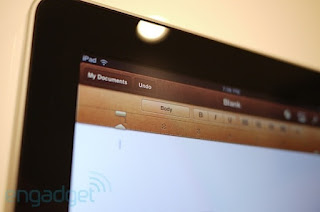
There's no question that the route Apple has taken is genius; they've built a "computer" that's so obvious and easy to use that anyone can pick it up and understand it immediately. And there's a lot to like, particularly in some of the innovative and engaging applications being built by third party developers right now, like the Marvel app, TweetDeck, or SketchBook Pro. But there are holes here too -- big ones -- and not just in the user interface.
For starters, as we mentioned earlier the iPad doesn't support multitasking, save for Apple's own applications: Safari, iPod, and Mail. Everything else you use on the device is a jump-into and then jump-out experience, which means that for things like IM apps, you're either having a conversation or you're not. For those of us who are used to the iPhone way of doing things, that's at least familiar, but if you're looking to have a conversation while getting your email in order (as you would on a laptop), you're out of luck. The same goes for those of us who like to keep a Twitter app open in the background to monitor updates. Even updating settings or downloading software is a chore due to the stop-start nature of the OS. You just have to go one. at. a. time. That's almost acceptable for a smartphone -- you don't expect laptop performance -- but this is different. Admittedly, there aren't a huge number of scenarios where you need to be multitasking, but it's not uncommon for Engadget editors to keep a running IRC session, AIM, a browser, Twitter app, Skype, and music player open at the same time, and we suspect a lot of you out there do the same (or similar). So how much of a stumbling block is the lack of multitasking? The honest truth is that a large number of users won't notice or care, which is why it's easy for Apple to ignore the problem (or claim that their OS supports the functionality because they allow a handful of their native apps to run in the background). For the rest of us, this is starting to feel just like copy and paste -- a problem so obvious and so easy to fix that it's just perplexing Apple doesn't come up with a solution and end the conversation. The iPad may do many things better than a netbook, but multitasking is not one of them.
Adding difficulty to that lack of multitasking is the way the iPad handles notifications. As you know, Apple provides a method of utilizing push notifications to circumvent backgrounding an app. For instance, with AIM set to deliver push messages, you can still see what your contacts are IM'ing at you, and jump back into the app when you need to respond. That's all well and good, but Apple is still handling notifications in the same terrible, interruptive manner that it uses on the iPhone. Namely, pop-up messages that must be dismissed by the user. Imagine if you had to repeatedly click "OK" on a pop-up window which froze you out of the application you were working in every time you got an IM on your laptop, and you'll start to get the idea. Again, this isn't great on a phone, but hey -- it's a phone. On your revolutionary new computer-like device? It's extremely annoying. You can always set the notifications to just a sound and badge, but we know Android and webOS handle this more elegantly, and can't figure out why Apple won't do the same.
To put a point on the iPad's UI and the user experience: there is no question that Apple has created an engaging, simple, and surprisingly powerful platform for this device. For many of the applications -- especially some of the third party titles starting to trickle out -- the stuff people are coming up with is insanely clever, just plain cool, or both. For many consumers, it will be easy enough to accomplish much of what you would with a netbook or laptop on the iPad, and yet other experiences will extend far beyond what you would do on a typical computer. It's not a laptop replacement, and this OS can't do everything a laptop can do -- but maybe it doesn't have to.
Included applications
We're not going to go super deep into all of the bundled applications, but we feel quite a few deserve special mention. There are brand new applications that are hugely important to what the iPad is and does, and we wanted to take a moment to give an overview and opinion on what we felt really stood out.
Mobile Safari
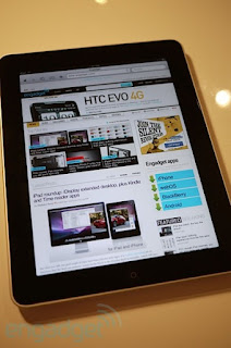
Apple promises that web browsing on the iPad will be, to quote Steve Jobs, "The best browsing experience you've ever had." Let's just go over that one more time -- Steve Jobs says that the browsing experience will be the best you've ever had. So, is it? Well, we can tell you this: the browsing experience on the iPad is amazing. It is smooth, fast, and fluid. The screen displays beautifully in landscape or portrait, the scrolling is buttery, touch response is out of this world, and you can easily pinch-to-zoom all over the place with nary a hiccup. The finger-based navigation really is kind of spectacular, and it makes browsing weirdly like rediscovering an old friend. Other additions to the app like a proper bookmarks bar, use of toolbar drop downs, and an improved tab grid make it a pleasure to use. It is without question one of the best browsing experiences we've encountered. But is it the best? Well, not really.
Why, you ask? Well that answer is simple and extremely complicated at the same time. Currently, there is a web standard called Flash, developed by a company named Adobe, which allows for the easy insertion of rich media into webpages. That's everything from streaming video and audio files, online gaming, to entire websites made using its broad and deep development tools. The penetration percentage for Flash on PCs around the world is something like 98 -- that's almost everyone -- and many, many sites employ the standard on their pages. When we say many, we mean most if not all of the pages you typically visit use Flash to display some of their content. The iPad browser doesn't support Flash, and won't support Flash, perhaps ever. Apple has not only turned away from what is the industry standard for rich media in webpages, but it instead is pushing a newer standard called HTML5. Apple has been very successful thus far in moving its agenda forward and bringing websites into the fold of HTML5, but we're talking maybe, say, one percent of websites on the internet. Probably way less.
So what does this mean for an end user? Well it means that when you visit a site like Hulu, HBO, NBC, Lala (which ironically, Apple just purchased), Engadget, Gizmodo, or many, many others, you will have a broken experience. That means there will be certain elements of these sites (in the case of HBO, the entire site itself) that simply won't work. Now, we're geeks. We get it. We know what's going on when a site shows the broken plugin icon, or says we need Flash. But to the wide world of "everyone" that Apple wants to sell this product to, this will result in a confusing and frustrating experience... a broken experience. That may be fine to Apple, but it isn't fine to us, and shouldn't be fine to the rest of the world. As an aside, we've been surprised other iPad reviews have not been more forthcoming in pointing this problem out -- this is not a small thing; it's is a major deficit in the iPad's browser. Now keep in mind we're not saying we love Flash and want to marry it -- in fact, we'd love to see a less CPU intensive format take its place -- but HTML5 isn't that format, at least not yet. It's important to understand that a lot of users will see the lack of Flash as a drawback, even if Apple doesn't like the standard, and even if Safari on the iPad is a brilliant experience (which it frankly is).
iBooks
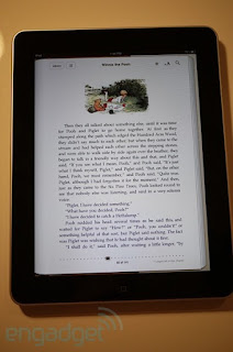
To say Apple is about to put a major dent in Kindleworld is an understatement. The iBooks app is one of the most beautiful and thoughtful uses of the iPad screen real estate on the device. It would be easy to rattle off a thosand words alone on how good of an e-book experience this is, but we'll try to keep it brief considering how much there is to say about the iPad. Simply put, it's a great e-reader with enough options to please even the most strident critic. The layout is quite simple; along the top of the page in portrait mode you have a button to flip to your library (a very slick hidden room kind of effect), a chapter button, brightness control, font size and face options, and a search drop down. Within the book you can long press to bring up copy / paste, dictionary (a beautiful implementation which pops up right over your content), bookmark (another perfect implementation), or search options. Besides the incredibly sexy page turning animations -- useless but gorgeous nonetheless -- the entire package is just so airtight. It's the first e-book reading experience we've seen that seems to truly understand the visceral, sensual enjoyment of holding an actual volume in your hand.
Calendar / Contacts
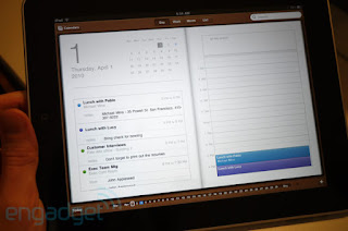
The calendar and contacts apps on the device aren't exactly groundbreaking, but they are far more usable and information heavy on the iPad. Both utilize -- at different intervals -- split screen, book-like displays. The calendar app actually gives you a proper full month view and lets you interact with your schedule much like the iCal application for OS X does.
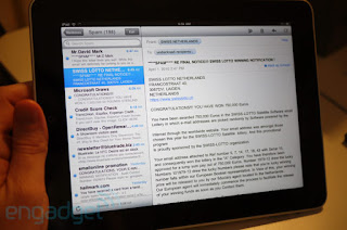
This is a biggie for Engadget. Much of our time is spent dealing with email, and it hasn't always been a pleasure on the iPhone. Has that changed on the iPad? Not quite. As Gmail enthusiasts, we're sort of locked into the label / archiving / conversation scheme the big G has worked up. Honestly, we think it's a smarter, faster way to handle lots of email from lots of places. On Mail for OS X, Apple at least adopts threaded messages to keep your conversations under control, but no such luck here. In other "the iPad is not a computer" news, we couldn't find a way to export a .txt file to any of the applications on the device, thus seriously hamstringing our ability to finish this review on the iPad itself. We also take issue with how Apple wants you to handle attachments here. They have to be done from the source app out into Mail -- what the hell kind of sense does that make? In all, we love the split screen displays and real estate for composing, but still feel like we're floating out in the ether when managing our email. It works, it's fast, it's consistent... it's just not what it could be.
iTunes / iBookstore / App Store
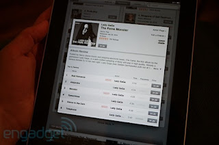
All three of these money-shredding stores on the iPad hew much more closely to the desktop version of iTunes, which is a really good thing. Finding, previewing, and buying titles is super simple due to the vast amount of data you get in a single view, and the modals which Apple uses to perfect effect here to pop over info about the content as you're checking it out. The iBookstore is a perfect companion to the reader, but we did find the current selection lacking (very little Philip K. Dick and George R.R. Martin -- for shame!). Downloading was clear and simple, and there are free samples (as well as lots of free titles) to pick up if you just want to test the waters. It's obvious that publishers who aren't yet involved with Apple will see the light on this -- if the company is half as successful at pushing books as it has been at pushing music, this is indeed a game changer. We're not saying there's no room for improvement, because there is plenty (such as a clearer and more coherent periodicals strategy). Still, this is a tried and tested model for the company, and the iPad versions deliver (well, the iBookstore delivers for the first time ever).
Video / iPod / YouTube
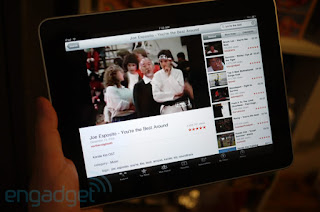
The entertainment portions of the iPad aren't going to blow anyone away, but they all do an admirable job. The iPod app is actually much, much better than its smaller cousin, though we're surprised that Apple hasn't leveraged its new-ish iTunes LP content here. The iPad is the perfect place to view all that rich media, yet it's nowhere to be found on the tablet. A real miss, guys! Otherwise, the video player takes on the task of running your video (up to 720p, with restrictions) in a solid if spartan manner. We'd like to pause and just mention how sweet the marriage of HD content and the iPad's display is. Video really does look absolutely stunning on this screen -- Apple has done its homework on the tech, and we couldn't be more impressed with the results.
YouTube makes big use of the segmented windows concept you see all over the device, giving you the option to browse other videos or even comment on what you're watching while it's playing. Of course, it also allows for YouTube HD content, which looks fairly sharp most of the time.
iPhone apps on the iPad
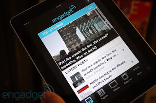
Yes -- the iPad can run almost all 150,000 of the iPhone and iPod touch apps you know and love (not every one is compatible, but the vast majority). It does this in two modes, the first is a scaled down version in the middle of your giant screen, while the other is a pixel doubled iteration. Both of these leave something to be desired, and we can't say that anything besides gaming really ends up looking okay. It's nice that Apple has included the functionality, but keep in mind that you are locked into what is essentially an iPhone simulator, complete with an iPhone keyboard (scaled up if you're using the pixel doubling, which doesn't look that great). It's tremendous because you have access to applications you may need to use, but it's not something you're probably going to spend a lot of time with.
The iWork suite
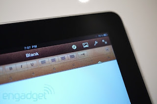
If you doubt the claim that the iPad can be a viable tool for creating content -- even stuffy businessman content -- then these apps should seriously make you clam up. They are superb, surprisingly useful, amazingly robust applications. We don't necessarily agree with Apple's saving scheme (in that, there really isn't one), but you can't knock the core functionality of these apps. It's clear that at some point Apple is going to have to open up some kind of shared file repository on these devices to make them truly effective tools, but the combo of Numbers, Keynote, and Pages show that getting work done on these devices is not only possible, but actually kind of good in the right hands.
Our columnist and friend Michael Gartenberg has a lengthier piece which will be up later today on Engadget that goes a bit deeper on these apps -- if you're interested to hear how they fare for a very busy man, you'll want to read it.
Third-party apps
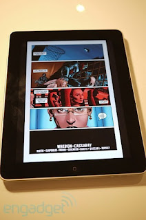
There are really far too many third-party apps to do a deep dive on, but we want to call out a few innovators that we feel are making the iPad seem like a viable fourth screen we want to engage with. Here's a lightning-round rundown of what we saw and liked the most, but you can see a much larger and more detailed list right here:
* Marvel: This is just a cool application, and really gets our juices flowing about what will be possible with this larger format. Excellent execution, but they need to convert the whole catalog into this format. When we can re-read the Secret Wars on our iPad, we'll be seriously happy campers.
* ABC video player: Even though it feels like a sidestep around the Flash issue, this iPad app does a perfect job of managing the network's online video assets. We can only imagine Hulu will stir things up in a similar manner.
* Netflix: It's Netflix. On the iPad. And now apparently it's headed to the iPhone and iPod touch as well.
* USA Today, The Wall Street Journal, and the New York Times: If this is printed media's last gasp, it's definitely a lungful. All three of these apps show that the big boys still have some fight in them, and while we can't abide the WSJ's zany pricing scheme, we will admit that each of these does a beautiful job of delivering the newspaper in a whole new way. Kudos, boys.
* Yahoo! Entertainment: This one was an honest surprise. We didn't expect Yahoo!'s first iPad product to be either handsome or useful... and it's both. The TV schedule and news presentation is top notch, though we're hoping they take things a little deeper in future updates. And when it comes to entertainment gossip, we won't really be satisfied till an US Weekly app appears.
* Photogene, SketchBook Pro, and Brushes: Three apps that show the iPad can and will be a content creation tool as well as a content consuming tool. We used and loved all of them, and think they show amazing potential for this platform.
* TweetDeck: Just a really, really good way to use Twitter. A lot like the desktop app. If only we could run it in the background...
Battery life
It's almost impossible to believe, but during our initial tests, using the iPad pretty heavily, downloading and using lots of new apps, doing some 3D gaming, watching HD video, all the while getting email downloaded in the background, we got just about what Apple claims this device will do. In fact, it went a little better -- we managed to get 10 hours and 43 minutes of life out of the iPad before we had to plug it in again in our first run through. That's pretty crazy endurance considering what we were doing with it. Now, we were not watching HD video the whole time, or running the music player in the background while streaming Netflix movies, so we can't promise this will be the case in every situation. Still, it did a pretty amazing job of matching up to Apple's numbers, and you may color us impressed.
We're going to be doing further battery testing once some other team members get their devices, so hopefully we'll be able to report back with a more well-rounded assessment of what this thing is capable (or not capable) of.
Wrap-up
At this point we've run the full spectrum on iPad opinion. It should be clear that there are aspects of this device which we love, and others which we clearly do not. In summarizing our feelings about the iPad, we're forced to take two paths -- one which analyzes the device's position in relation to the advancement of the personal computer, and one which clearly speaks to whether or not we think you should spend your money on this thing.
Path one: the iPad as a computing revolution. Does the iPad evolve the personal computer in a significant way? Yeah, actually, it kind of does. Despite what you think right now, and despite the limitations Apple has put on some aspects of this device, what it says to the market is significant. The iPad is powerful, elegant, and largely unlike any computer you've ever used. You know how first generation games for a console look kind of dated when you put them against titles released after years of honing? Imagine what will be happening with something like the iPad in a year or two. This stuff is legitimately important. It's not magical, but it's a little bit revolutionary, and you have to at least give Apple that. They've pulled off a cohesive touch computing platform with very few rough edges -- and that's no small feat.
Path two: should you buy into the revolution today? The first thing that must be said -- although we've already stated it -- is that we don't think the iPad is a laptop replacement. Not yet. What that means is that if you need a laptop to work in something like Excel, Word, or countless other PC or Mac applications, you shouldn't expect the iPad to take its place. But, if you're like a lot of computer users, you don't really do much on your system except for listen to music, casually browse the web and read news sites, watch some online video, play games, and keep in touch with friends via Twitter, IM, and Facebook. If you fit that description, you might just fall in love with Apple's $499 bundle of joy -- because it does the majority of those things much better than its laptop counterparts (granted, one at a time, and, er... not online video).
So the verdict? The buyer of an iPad is one of two people, the first is someone who sees not just the present, but the potential of a product like the iPad... and believes in and is excited about that potential. This is also a person who can afford what amounts to a luxury item. The second is an individual who simply doesn't need to get that much work done, and would prefer their computing experience to be easier, faster, and simpler. Does that sound like anyone you know?
Tidak ada komentar:
Posting Komentar